
Typography Books
4 December 2014
I decided to read a couple of books on typography as I knew that was a weak point for me when it comes to design. I suppose I knew what particularly bad typography looked like but when it came to choosing fonts for my own projects I haven't really known what to look for. Sans serif is easier to read on the web, right?
The Elements of Typographic Style:
Version 3.0
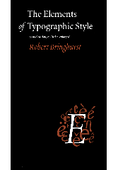
Everywhere I looked, people said that Bringhurst's book was THE book on typography. The title, referencing Strunk and White's indispensable guide, sets a high bar. Unlike The Elements of Style, which emphasizes brevity, clarity and structure, The Elements of Typographic Style is long, and it's organizational scheme is muddy.
Some relevant information does manage to shine through the purple prose. Bringhurst provides an interesting, if disjointed, history of typography. Having wandered through what might well have been a 300 page train-of-thought narrative I did learn to pay more attention to whitespace, to the non-alphanumeric characters of a typeface, and to the historical connotations a typeface may carry.
It was a useful book, but it might have stood to benefit from Strunk and White's admonishment to "omit needless words." I was also a little miffed that the book was unavailable in digital format.
On Web Typography

Jason Santa Maria's book was a little more practical and a lot more concise (than Bringhurst). I was grateful in particular for the explanations of typographical terminology. There was a lot of good information here, and I'm not sure how much I was able to take in on first read. But with it's clear organizational structure I'll be able to turn back to it when I need a refresher.